
All of them in the theme. No page builder, no app stack renting you your own storefront.
Case study · a brand we own
A store built to sell more to everyone who arrives.
Portrelle is our own skincare label. We built the storefront around the value of a visit: a quiz that routes people to a routine, an upsell with live totals, priced sets and a basket that never leaves the page.
Home2
Quiz1
Product8
Sets1
Cart2
The product template carries eight of them on its own.
14conversion featuresbuilt into the theme
3languages, livein one theme
0apps paying rentno monthly app fees
ExploreShopify, page by page
Walk through the store.
Pick a page to see the conversion features built into it. Every one lives in the theme, so none of them is an app charging by the month.
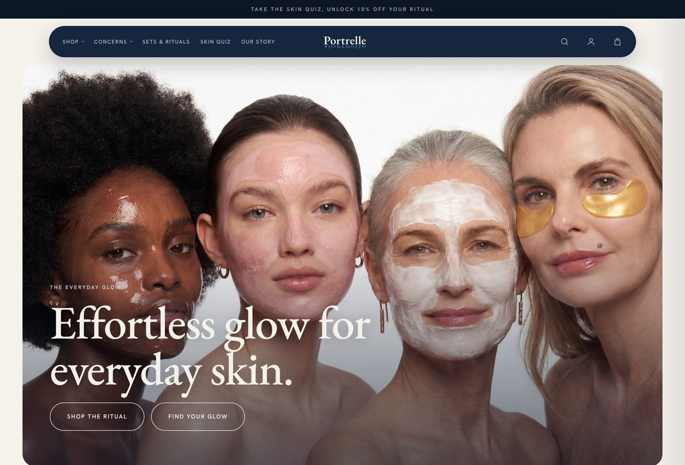
01Announcement bar tied to the quizOne offer, one job, pointing at the highest intent page on the site.
Home
Skin quiz
Product page
Sets & rituals
Cart
Fourteen conversion features, three languages, one theme.0 apps paying rent
The brief was the value of a visit, not a homepage.
Portrelle sells skincare. The brief was not a homepage. It was the value of a visit: every arrival should leave with a routine rather than a single tube, and the store should do that work on its own, in three languages, without a page builder underneath it.
So we built the storefront around four questions. What does this person need? How do we tell them in one screen? What goes with it? And what makes the basket worth finishing? Every feature below answers one of those, and all fourteen of them are live.
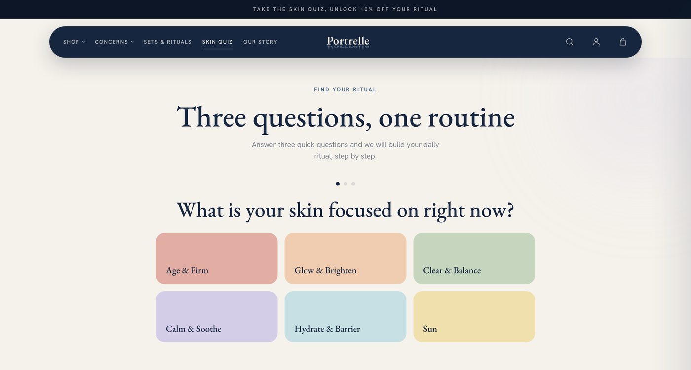
Three question skin quiz
Routes a stranger to one routine instead of a catalogue.
Concern led navigation
The menu is organised by what is wrong with your skin, not by product type.
Announcement bar tied to the quiz
One offer, one job, pointing at the highest intent page on the site.
Gallery with thumbnail swap
Instant, no reload, no layout jump.
Attribute chips
Skin type, texture and use, readable in a second above the fold.
Why it works for you, tabbed
The ingredient argument, without a wall of text.
How it feels
A split panel for the thing photography cannot carry.
Question accordions
The objections that stop a first order, answered on the page.
Reviews on the product page
Social proof where the decision happens.
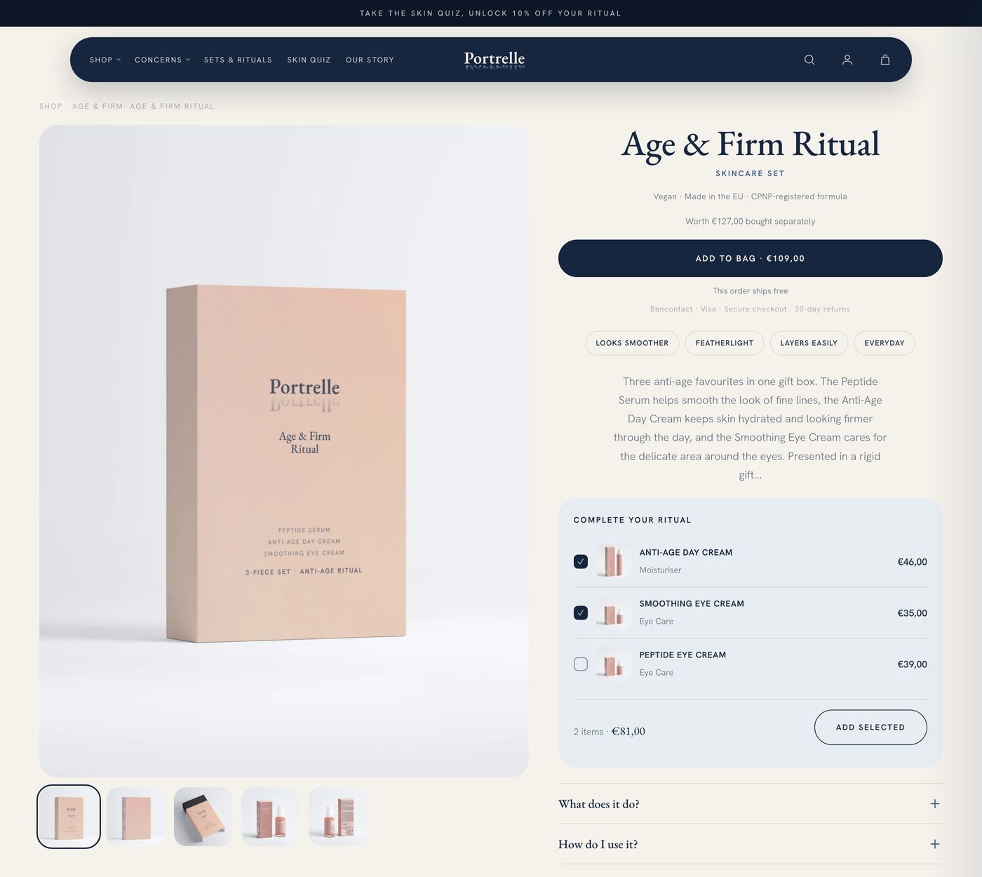
Complete your ritual
A checkbox upsell with a live running total and one add button.
Worth bought separately
Every set shows the arithmetic instead of asking for trust.
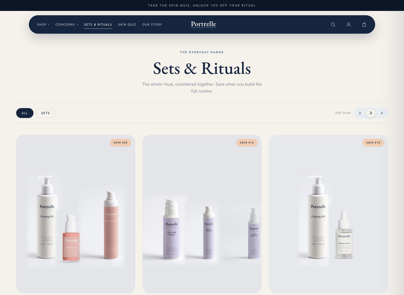
Sets and rituals collection
Bundles with the saving on the card, before the click.
Free shipping progress bar
Pinned to the basket, counting up to the threshold.
Cart drawer
The basket never takes anyone off the page they were buying from.
This one is a build study. What we shipped, why each piece is there, and what it is doing on the page. Every screenshot below is the live store.
Three questions, one routine.
Skincare has a hard first minute. Somebody lands who knows their skin is dry and knows nothing else, and a nine product grid is the worst possible answer.
The quiz asks three questions and returns one routine. Concern first, in six tiles that are colour coded so the choice reads as a picture rather than a form. It is the destination of the announcement bar, the homepage hero and the top of the menu, because it is the highest intent page on the site.
Three questions, one routine. Colour coded concern tiles, no account, no email wall in front of the answer.
One product template doing six jobs.
The product page is where the money is decided, so it carries the most engineering on the store. It is one template, not a stack of apps.
Above the fold
Gallery with thumbnail swap, attribute chips for skin type and texture, price, and the add button. Nothing to scroll for before you can buy.
Why it works for you
The ingredient argument in tabs, so the detail is there for the reader who wants it and invisible to the one who does not.
How it feels
A split panel with the sensory copy, because texture is the thing photography cannot carry.
Questions
Accordions holding the objections that stop a first order, answered on the page rather than in an email later.
Reviews
On the page, at the point of decision.
Complete your ritual
The upsell, directly under the buy column. Section 04.
One product template. Chips, tabs, accordions, reviews and the ritual upsell, all in the theme.
An upsell that shows its arithmetic.
Most upsells ask you to trust an arithmetic you cannot see. This one shows it.
Under the buy column sits Complete your ritual. Tick the products that go with the one you are looking at and the button updates as you go: two items, thirty one euro, add selected. One click adds the lot. No modal, no second page, no app tax, and the total is always the total.
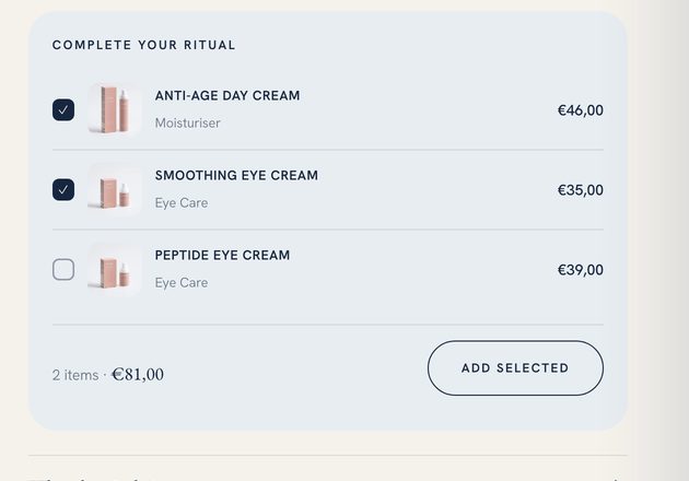
Live totals on the button itself. The reader can see exactly what ticking a box costs before they tick it.
The same principle runs on the sets: every bundle carries a worth bought separately line next to its price, so the saving is arithmetic the customer can check rather than a badge they have to believe.
A routine is a bundle. So we sold it as one.
A routine is a bundle whether or not you sell it as one. So we sold it as one.
The sets and rituals collection prices the routine, shows the saving on the card before anyone clicks, and repeats the worth bought separately arithmetic on the product page. It is the difference between an order of one tube and an order of three, and it is the cheapest lift available to almost any skincare catalogue.
Savings on the card, before the click. Priced sets that make the routine the default purchase.
The last stretch, engineered.
Two things happen at the basket, and both of them are worth engineering.
The shipping bar
A progress bar pinned to the bottom of the window, counting the basket up to the fifty euro free shipping threshold. It updates on every add, from any page, without a reload.
The drawer
The basket opens over the page. Nobody is sent to a cart URL, nobody loses the product they were reading, and adding one more thing costs a single click.
Together they turn the last stretch of the visit into a number the customer wants to reach, instead of a form they have to survive.
The layer that makes it feel expensive.
Then the layer that does not show up in a feature list but is the reason the store feels expensive.
View transitions
The product image carries from the collection grid into the product page as a shared element, so the click reads as a zoom rather than a page load.
Reveal on scroll
Sections arrive rather than appear. Restrained enough that nobody notices it, which is the point.
Pointer polish, fine pointers only
Magnetic hover on the controls for anyone using a mouse, switched off entirely on touch where it would only get in the way.
Product hotspots
Editorial imagery with buyable points on it, so a lifestyle shot has somewhere to go.
Bento and editorial grids
Homepage, collection and journal laid out as a magazine rather than a template.
Chat drawer
In the theme, on the page, not a third party bubble loading half a megabyte of someone else's javascript.
portrelle.com. Announcement bar to the quiz, hero, trust strip, then the editorial grid.
Three languages, and a menu that agrees with the search bar.
The store runs in English, Dutch and French, and the words are treated as part of the build rather than a translation job at the end.
Navigation is organised by concern, which is how people search, so the menu and the search terms agree with each other. Product copy, the FAQ and the journal are written to the question, not to the product sheet. That is the same discipline behind the Phrase Studios case study, applied to a catalogue instead of a Journal.
Conversion features14
Languages, live3
English, Dutch and French, with the taxonomy translated rather than the labels alone.
Theme1
One codebase. Every feature on this page ships and rolls back with it.
Building inside the theme instead of on top of it is what keeps the store fast, keeps the monthly app bill near zero, and means the next change is an edit rather than a negotiation.
What we would build on yours.
You almost certainly do not need all fourteen. Here is the order we would work in.
- Find where the value of a visit leaks. Usually one of three places: nobody knows which product is theirs, nothing is offered alongside it, or the basket is a dead end.
- Fix the product page first. It is the page with the most traffic and the most decisions on it, and it is where an upsell earns the most.
- Add the routine. Sets, bundles, a quiz, whatever your catalogue calls a routine. Priced, with the arithmetic shown.
- Then the last stretch. Shipping threshold, drawer, and the polish that makes the whole thing feel like it was built on purpose.
All of it inside your theme, all of it yours, and all of it measured against the same baseline we take in week one.
The next step
Want your store working this hard?
Send us the URL. We come back with where the value of a visit is leaking, and the three changes we would make first.
Or write to hello@roasdept.com
Pick what matters and the audit is written around it.